Digital Publishing
The expansion of editorial in the digital space whether in apps or online offers exciting opportunities to extend and engage readership. From the first digital publication to interactive extensions in app and web design, we helped define the new digital age of editorial in fine art, fashion, education, travel, and lifestyle industries.
From the Beginning
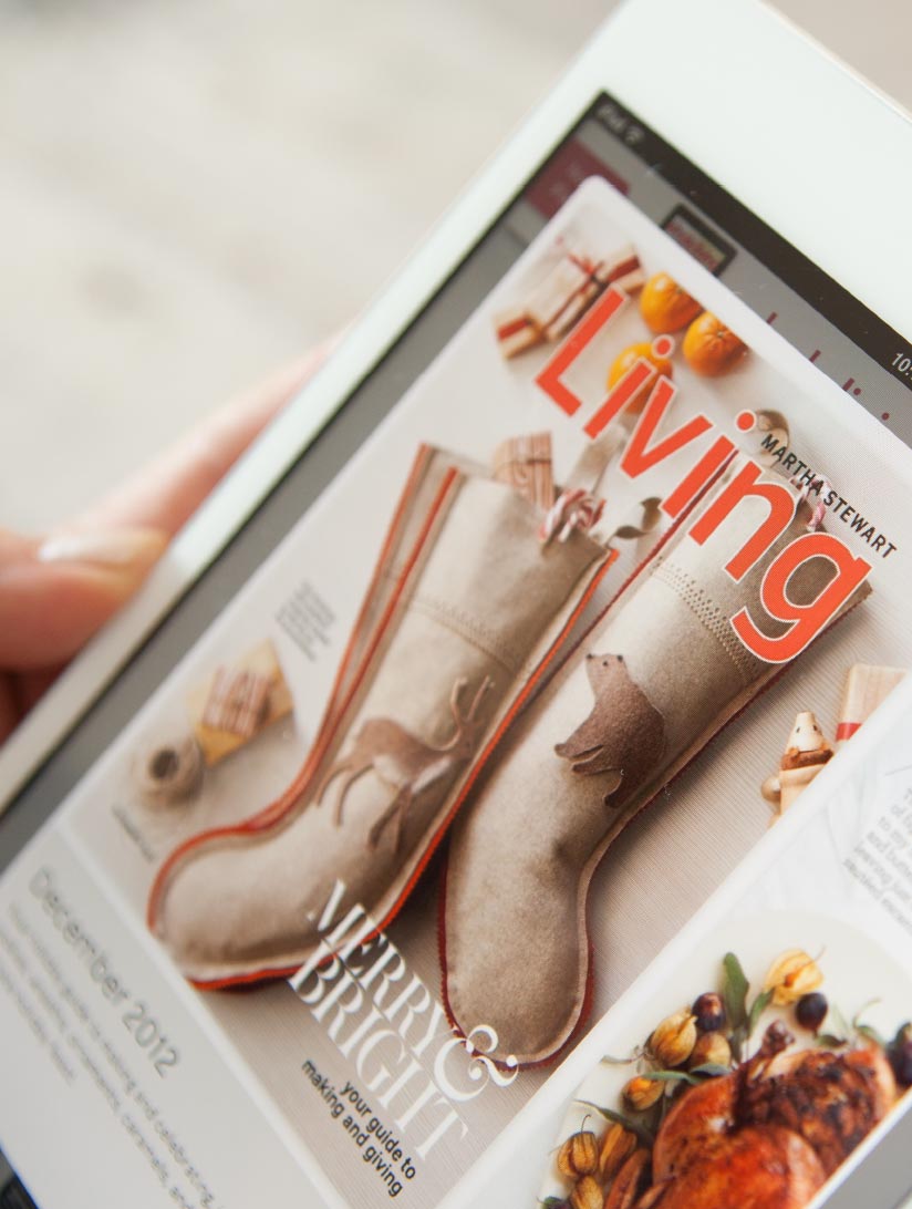
We began with Martha Stewart Living collaborating with a small team to create their introduction into digital publishing with Boundless Beauty. Featuring the first filmic cover, the digital magazine gained Martha Stewart Living the first digital award offered by the SPD’s and recognition by Time Magazine’s coveted list of Top Ten Everything in 2010.
Defining Digital
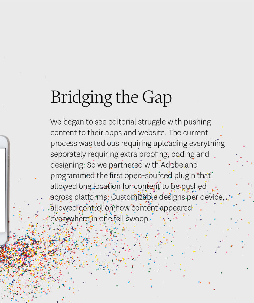
We helped establish the digital strategy with our editoral partners. We envisioned, designed and developed the first storefronts with Adobe enabling readers access issues, new apps, videos, and evergreen content. We helped define the new user experience within the apps, developed new advertising techniques, and created reusable digital integrations to extend user engagement.
Sotheby’s
The Sotheby’s App featured access to each of their auction catalogs while also giving access to an up to date view on past, current, and upcoming actions with details of every item up for bidding.
Dior
The Sotheby’s App featured access to each of their auction catalogs while also giving access to an up to date view on past, current, and upcoming actions with details of every item up for bidding.

MyGQ
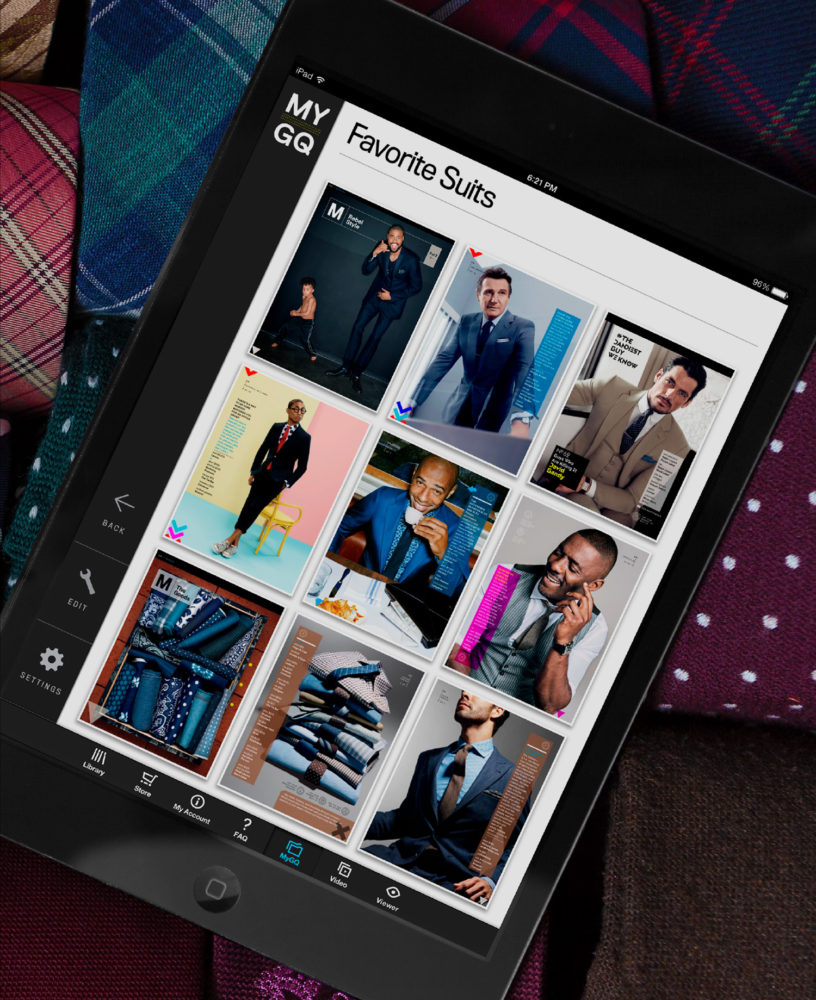
See a suit you want to remember or a gift idea for someone? MYGQ is a digital collection application that allows readers to save GQ articles, pages, make GQ collections and even shop products from in the GQ magazine itself. It opened new opportunities for advertising creating custom collections for readers to browse offering targeted marketing directly to GQ readers.
Bon Appetit
Kitchen Mode
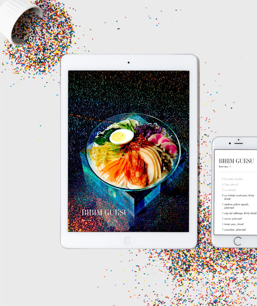
Impermeable to flower, easy to wipe off, and a nice bright screen made digital devices the perfect cooking companion. For Bon Appétit, we designed and developed Cook Mode which made any recipe easy to see and follow directly from the publication itself. Simple step by step inscriptions, quick access to ingredients and a clean typography made cooking even a chocolate souffle easy.
Readers Digest
We designed and developed the Reader’s Digest App integrating the plugin so they could launch their new redesign across tablet, mobile and website. The App enabled interactive image galleries, custom designs for feature articles and included visual breathers with inspiring quotes that RD readers come to enjoy.
Gather Journal
To help boost readership, we design and developed a dedicated Recipe app as a companion to their award winning print publication. The plugin allowed a small and nimble team to release all that was digital simultaneously to when the publication hit the newsstands. The Gather App would later be featured on the Apple App store as one of the best designed recipe apps available gaining Gather Journal over a million new eyes a day on there brand.
Read the Gather Case Study here.y.
Rapid prototypes for startups
For Startup’s the App plugin allowed for fully functioning prototypes in third of the time. For the Liqueur Cabinet, designed and developed their first iteration of the app enabling them to hit the ground running and secure first round of funding.
Captivating Online
With our experience in editorial and our expertise in strategy, design, and development we extended reader engagement throughout the web. We approached editorial web design from all angles integrating advertising, custom content and ways to leverage evergreen content to keep websites fresh and flexible to grow long past our involvement.
MIT News
On campus and around the world. The MIT News website features cutting edge work from one of the most coveted institutions. We designed the homepage to show local and global news while also citing all the exciting publications like The New York Times, BBC, and Reuters where MIT work was being featured. Strategically understanding that most readers come to the website from links outside of MIT News, we placed the homepage at the bottom of each article allowing anyone who came to site to see all the newest and greatest articles.
Garden & Gun
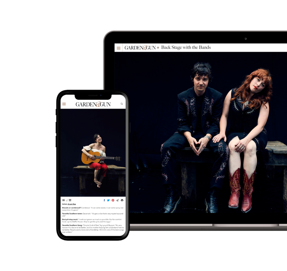
The Garden & Gun website features a modular and flexible design that allowed a new experience to readers every time they visited. We created two new verticals in Recipes and travel and empowered advertisers to have full page takeovers for curated content around events such as the Kentucky Derby or top Thanksgiving recipes. The Garden & Gun website incorporates a finely tuned reading experience through finessed type design and beautiful slideshows on any device.
Tufts Alumni Magazine
We designed the Tufts Alumni Magazine website to be as beautiful as their print counterpart. From an intuitive UX experience, to immersive article title slides, to special topics for new and evergreen content, the website is a fine tuned editorial approach that their readers came to expect.