SMFA at Tufts
Tufts University sought to elevate the newly acquired School of the Museum of Fine Arts while preserving what made it special—its experimental, messy spirit and its highly individualized approach to education.
With this in mind, we placed students and their art front and center to tell the story of SMFA.
Students Tell it Best
Quotes from in depth interviews, artist portraits and on campus photography and film became the school’s primary look and feel.
Let the students speak for their school
We built SMFA’s site around the idea that students tell it best. After all, who else is better-suited to give prospective students genuine insight into what it’s like to attend SMFA than its current students?
Over the course of several visits, our team got to really know these bright, young artists. We conducted in-depth interviews along with photography and film sessions. From these, we gathered quotes, artist portraits and additional imagery of students at work. These would go on to be the basis of the final look and feel.


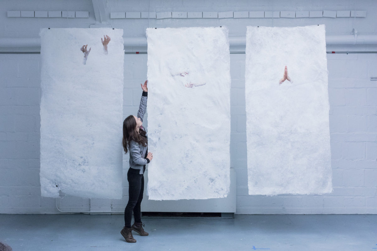
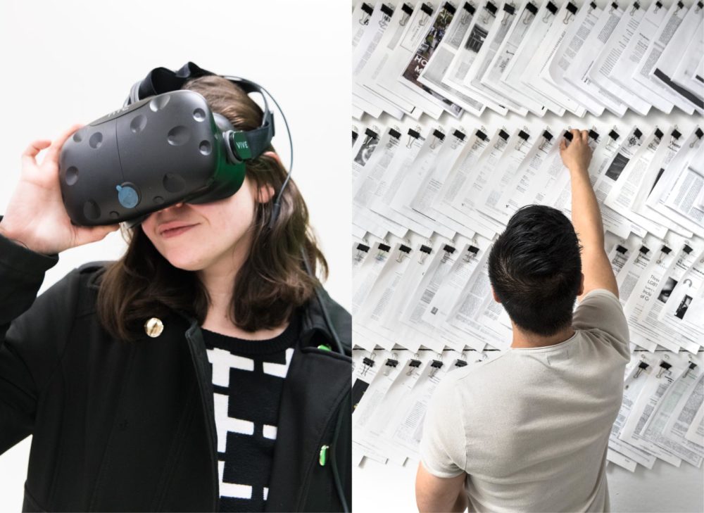
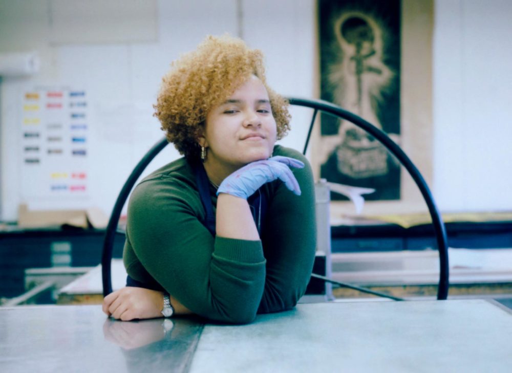
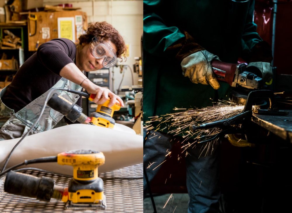
FILMING AND PHOTOGRAPHING ARTISTS IN ACTION
Process shots, portraits and imagery of artwork provide context and texture to SMFA’s personal and interdisciplinary fine arts program.

Conveying the structure and strength of a purposefully fluid program
Listening closely to professors, administrators, and other SMFA faculty, it became clear that one of their key challenges was how to position SMFA’s loosely-structured program in a manner that conveys confidence to prospective BFA students—and perhaps more importantly, their parents.
What has always attracted young talent to SMFA is the fluid, self-directed nature of its programs. The school offers just one major and very few set requirements. With our insight from both faculty and students, we were able to help the school define the framework that empowers students to succeed.
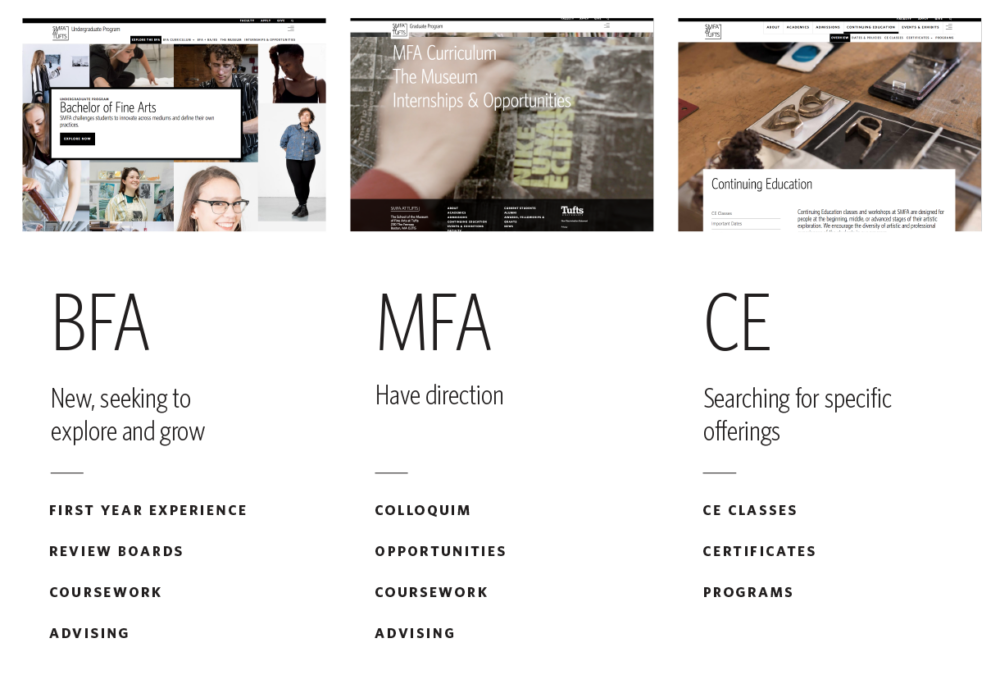
Serving a three distinct student audiences with different priorities
Prospective BFA, MFA and Continuing Education students are at different stages in their practices and require different messaging. We designed microsites to appeal directly to the specific audiences and their needs, while still existing within one container.
A new logo that honors two institutions with rich histories
Tufts’ acquisition of the school came with a new name and a need for a new logo. Founded in 1878 at the same time as the Museum, the school’s rich history is an important part of its present. This informative past lives on, in part, with the mark’s square reference to the original mark. The implied open square is also a nod to the nature of the school: loose and a culmination of small parts that make a whole.
The new logo as well as the accompany identity system employs fonts from Tufts’ overarching, university-wide style guide. Whitney, the primary font was chosen for its quirky character.
Flexible layouts for growth
Many site pages were built with customizable paragraph modules that offered highly styled, flexible page layouts that would support the growing and changing program for years to come.
Developing within an ecosystem
Built in Drupal 8 the site was designed to integrate into Tufts University’s existing ecosystem of websites. It ingested dynamic university-wide feeds like the calendaring system and news updates. We utilized Solr to power a class search engine. And we hosted everything on their servers while working closely with the school’s infrastructure team.